There are many well-known techniques to build trust on your website, including using real testimonials, incorporating trust-building 3rd party seals, showing logos of prominent customers, leveraging social proof and more. And you should use as many of those techniques as possible on your site! After all, trust concerns are one of the biggest reasons potential customers do not convert on most websites.
But most of those techniques are fairly expensive, either in terms of time and resources, or in the case of 3rd party seals, money. But are there some obvious trust builders that you are overlooking? How do your basic sales & marketing strategy decisions affect the trust generated on your site, and how can you use them to build more?
What Strategic Decisions Are We Talking About?
 Many of the core strategic decisions you have made with regard to how you are marketing your site and services or products will contribute either positively or negatively to the trust your site’s visitors will infer. I’m talking about things like how you have decided to base your shipping costs, your privacy policy, your refund or returns policy, what advertising guidelines you choose, etc.
Even decisions such as how you price your products or what kinds of promotions you offer to entice someone to try your products or services can have an effect on trust.
So how do these strategies affect the trustworthiness of your website and what can you do to improve that? Read on!
“Too Good To Be True” Offers Raise Flags
It’s great to be priced lower than your competition, or craft an introductory offer that is better than that of your competitors. But if the difference is a crazy one, visitors to your site will likely wonder why.
Think about this. If gasoline in your area sold for around $3.50 per gallon, but one gas station was selling it for $1.50, what would your initial thoughts be? Some people might flock to that station, but most would start to wonder if the gas was diluted, or might cause trouble with their engine. A station selling gas for $3.40 per gallon might get significantly more customers. But the one selling for $1.50 will get significantly more caution.
Here is a screenshot from a website called www.fashionbags.org. These are supposedly high-end handbags being sold at discounts exceeding 80%! What a deal! The site looks pretty normal, and if you weren’t paying attention to the url, a person might just assume it was either the main Coach site, or a legitimate distributor for them. But once you see that pricing, all kinds of red flags go up. Most people will start wondering right away if they will be receiving damaged purses, knock-offs, or nothing at all when they order.
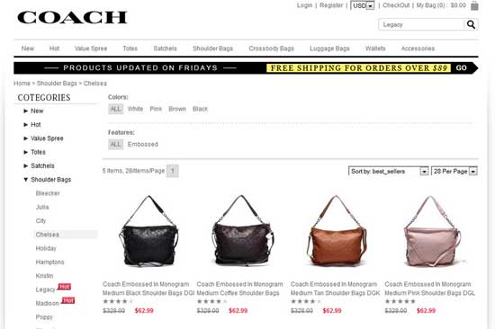
This site that purports to sell designer handbags has them discounted so deeply that it raises more questions and detracts from trust.
(Note: if you are trying to visit that site and it no longer is working, that wouldn’t surprise me. It was live at the time of this post, but Coach is admirably diligent about taking down these imitators.)
If Your Offer Really Is That Good, Clearly Explain Why
Sometimes, you really can beat the market’s offers by a wide margin. Occasionally, you will have a legitimate ability to make an offer that looks miles better than your competitors’. If that’s the case, it’s critical that you explain that advantage clearly, to remove questions.
Here’s a site called ThredUp. They are also selling designer bags at discounts of around 80%. But here is the thing. ThredUp clearly states throughout the site that the items they sell are previously owned. You know up front that you’re not buying new, but “like new”. Further, as illustrated in the screenshot, items that might have small flaws are called out clearly. On the product detail page for these items, they give even more details regarding the “tiny flaw” specific to each item.
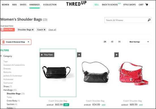
The ThredUp website is clear from the beginning that they sell previously-owned products, and also call out flaws that some products might have.
Prominently Point Out Advantageous Strategic Decisions
You may not have any too-good-to-be-true offers, but if you do decide to differentiate yourself from the competition in areas like shipping costs or return policy, well done! Things like free shipping and easy returns go a very long way to increasing trust. But make sure people are aware of these advantages!
Sunglass Hut has a great return policy. While most online stores allow returns within 30 days (or often not even that long), and many require you to follow a complicated procedure to get that, Sunglass Hut offers returns on any items, no questions asked, for up to 90 days. So that’s great, but what I like about their site is that they call out that advantage so well and so clearly.
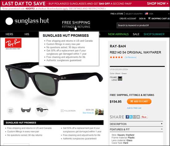
The Sunglass Hut website calls out the liberal return policy loud & clear on all pages, with an easy-to-read summary instead of leaglease.
Every page has “Free Shipping Fittings & Returns” front and center at the top of the page. And they repeat that again right above the Add To Cart call to action. That’s just done so well. But even better, if you mouse over that statement at the top of the page, they pop up a brief summary of the shipping and return policies. They don’t give you a bunch of legal mumbo-jumbo, just an easy-to-understand overview. Talk about building confidence in your visitors. Sunglass Hut does this almost perfectly.
Now compare that to Sephora. They also offer a great 90 days return policy. Here is their product detail page for makeup. A return policy for makeup is quite important. Someone buying makeup online will be concerned about how close to actual the color they are purchasing is, etc. And some sites don’t accept returns on makeup at all since it often cannot be resold. So Sephora’s return policy for makeup is excellent.
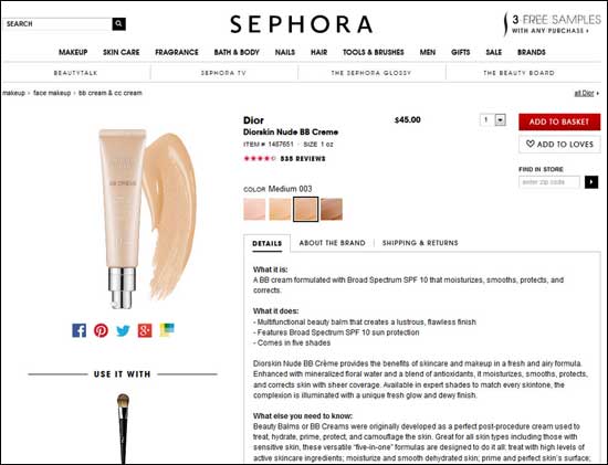
Sephora also has a great return policy. But they waste the chance to use it to build more trust by burying it under a nondescript tab.
However, hardly anyone would know that from looking at this page. You have to notice the small “Shipping & Returns” tab in the middle of the page, click it, and then read the text that comes up. And that text does not even mention the 90 days, so many people would assume that their window is much smaller.
Sephora is wasting an opportunity to increase trust on their site here. Of course they are aided in that they already have a lot of value in their brand, but it would be so simple to call out their excellent return policy more prominently, and closer to the call to action on this page.
No Credit Card Needed
Here’s another example of optimizing the potential trust from an advantageous decision (and not). Satellite radio provider SiriusXM offers a 30 day free trial. That’s a great way to get people interested in your service. But most of us know that most free trials still require us to give up our credit card number and then cancel if we don’t want to keep the service after the trial.
But Sirius is part of a growing number of wise merchants who do not require a credit card number from people signing up for the free trial. That’s a huge trust-builder! This will make people much more confident in Sirius and more willing to try their service.

SiriusXM builds trust by not requiring a credit card for the Free Trial, and calls that out very well right at the top of the page in bold print.
To their credit, Sirius does a great job of calling out all those advantages right at the top of their page. You land on that page and you’re offered a free trial, and you know right away it’s truly a no-strings-attached offer. Well done SiriusXM!
Marketing Software provider HubSpot also has a free 30 day trial. And like Sirius, they do not require a credit card number to sign up for that trial. So much trust is there waiting to be transferred to the visitor. Except HubSpot barely tells that visitor. If the user’s screen is big enough, they might see a very small line of text at the bottom of the page (below the fold for many though) that kind of mentions that no credit card is required. Opportunity wasted.
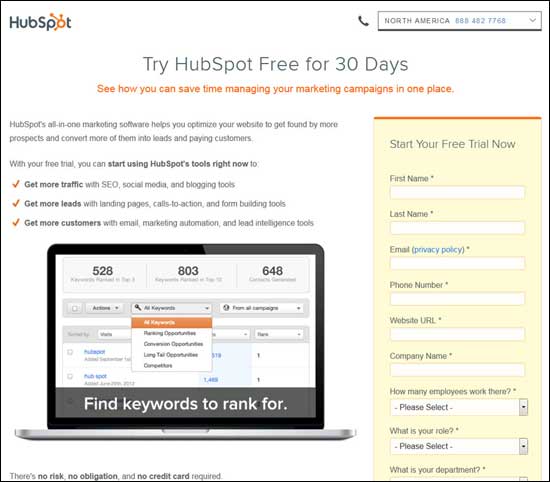
The HubSpot offer also does not require a credit card, but that information is buried below the fold for most users, and even then it is almost unnoticeable.
Relevant Policies Must Be Easy to Find on Relevant Pages
There are some pages in the conversion process of any site that are critical decision making points for the user. These are the major steps in the conversion process such as a product detail page (where the customer adds the product to the cart), a lead form on a Business-to-Business site, the Donate page of a non-profit site, the Checkout page on an ecommerce site, etc. On pages such as these, there will generally be a need to make all relevant policies as easy to find as possible.
If you are a B2B site and you have a lead form, include a link to your privacy policy right there by the form. That should be a minimum. If yours is a favorable policy, summarize it in one or two sentences right by the link, but in any case, put the link right there. That simple bit of transparency will go a long way toward trust building with your site’s visitors.
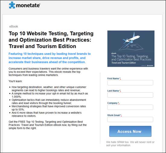
Here is a page from Monetate’s website to download an ebook in exchange for providing them some contact information. Right below the submit button on the form, Monetate includes a link to their privacy policy. Even better, they do it in the form of a reassuring statement saying that they do not sell your info to anyone. People interested in the ebook realize they may be contacted by Monetate, but feel good knowing that their email won’t be sold to anyone else.
Ecommerce Sites
Ecommerce sites have a number of policies that should be easy to find on pages such as the View Cart page and the Order Payment or Order Review pages. Privacy Policy is certainly one of them, and we already talked about the Return/Refund policy. Whether those are customer favorable or restrictive, putting links to those policies on the pages mentioned above will build more trust with your users.
The same goes for your Shipping policy. Put a link to that near the current shipping cost on the View Cart and Order Review pages. Make it easy for customers to understand why they are being charged for shipping and how it was calculated (as well as when they can expect to receive their order). And if there is sales tax being charged on the order, include a link near that charge to explain when tax is required and how it is calculated.
If you sell soft goods such as fonts or images that have different licenses or use restrictions, include links to those terms, again in a logical location on the page, near the product being sold.
Here is a picture of the Order Review & Payment page of the checkout process for Mineralogie Makeup, a WSO customer. We have made sure they have links to their Shipping policy and Explanation of Sales Tax right where those charges are displayed in the order. The links are called out such that anyone who wants to read more about them will notice them easily. Further, a link to the Return policy is shown immediately below the order total, and a link to the Privacy Policy is also there near the Submit Order button.
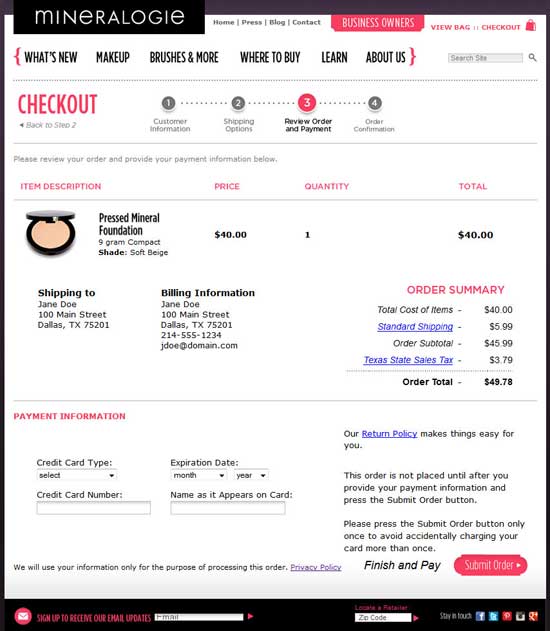
The Mineralogie order review page has clear links to all the relevant policies located where the customer might start having questions about them.
Go Build More Trust
Most online business owners think of their basic sales and marketing decisions purely as strategies in those areas. But they go a long way to either building trust, or raising trust concerns. If your policies are making potential customers wonder if you’re legitimate, think about how some slight changes could increase conversions significantly. And if you have good trust-building strategies in place, make sure they are presented well and prominently to take advantage of their trust-building potential!


