 We hear a lot these days about the use of opt-in popups to gather more email subscribers to mailing lists, and their effectiveness. So many sites use them these days. They must work. However, ask most people and they still hate them. So do they work, or do they drive people away?
The thing is, while I see a lot of commentary in the blogosphere saying that opt-in popups are effective, I see little recent data on how effective they are. That is, I see posts that will tell me how much faster they grew the opt-in list, which is great, but I see little detail about what kind of a conversion rate the pop-up itself might produce, and what the effect is on things like Bounce Rate.
So when the opportunity presented itself to measure this for one of our clients, we jumped at the chance. And they have allowed us to share those results with you!
Our Client: A Media Publishing Site
One of our clients, Lauren Publications, publishes several leading regional parenting magazines, and includes the website DFWChild.com, a site for the Dallas/Fort Worth area that incorporates material from three of their magazines, DallasChild, FortWorthChild, NorthTexasChild, and Thrive, a publication for parents of special-needs children. The site is a true resource of information and upcoming activities for parents throughout the area.
This site gets a fair amount of traffic, and was adding a few dozen signups per day to their email subscription list, which is used to send subscribers information on upcoming events for children in the local areas. Almost all of these signups were done through things like contests. Parents would opt-in when entering a contest or something like that.
The folks at Lauren Publications were happy with the size of their email list, but also knew it could grow faster. We all wanted to experiment with an opt-in popup overlay to see how it would do.
The Plan
The creative team at Lauren Publications designed the pop-up based on some input from us. We mainly advised them to not ask for any more information in the form than necessary, and to have the form itself properly communicate the benefits to the reader for signing up. And most importantly, since theirs is not a responsive site, the pop-up had to be sized so that it would not take over even a small smartphone screen. It had to be easily exited from all devices.

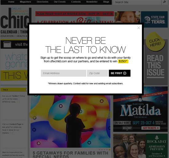
The pop-up designed for the DFWChild.com website had only two fields to fill out, and included a sense of urgency for the user in the title and the Call to Action. It also included a quarterly prize as an incentive.
They came back with a form that asked for only email address and ZIP Code (a crucial element to them for segmenting their list to provide relevant information). They did a good job of illustrating the value, taking things a step further by offering a $250 prize to be awarded to one subscriber each quarter as an incentive for signing up.
With the design in hand, we decided on showing the pop-up after a user had spent 30 seconds on the site, and to only show it on the first page of the session. After a user had seen the pop-up, they would not see it again for two weeks. And of course if they signed up, we’d not want the pop-up to display again, ever. These things would be controlled with cookies, so we know that as cookies get deleted or reset, some of these restrictions would be violated, but most visits would adhere to them.
Goals & Initial Results
As I said, I did not find much online regarding the conversion rates of opt-in popups. It’s fairly easy to find articles saying the rate by which subscriptions grew with the implementation of a popup, but not so much on the take rate of the form itself. So it was difficult to set a goal. I felt we would be happy with just a 1% conversion rate on the form (signups from the form divided by the number of times the form was displayed). However, we did know that the readers of these publications were fairly loyal, so a better rate was definitely possible.
We made sure to employ Google Analytics Event Tracking to measure the number of times the opt-in popup form was shown, and on which page of the site. We also used event tracking to track the number of times someone filled out the form, and verified those numbers with the actual subscriptions in the database.
We were pleasantly surprised after a month of the popup running to see that the form had sustained a conversion rate of over 2.75%. Total email subscriptions for those 31 days had more than quadrupled from the average, a 317% increase. We were all quite pleased!
But What About Engagement?
The other key thing to measure when reviewing the effect of a popup is how the visitors who do not sign up react. You don’t want to grow the list at the expense of your site’s primary goals.
If this were an ecommerce site, I’d be concerned mostly about the effect on Ecommerce Conversion Rate and Revenue Per Customer. But this site is about getting people to read more articles, so we were mostly concerned about Bounce Rate and Pages Per Session.
And in this case, neither of those metrics suffered at all. Bounce Rate is already a tough metric to judge for a media publishing site because many people come to the site by searching a given topic, with the search engine landing them directly on an article about that topic. In many cases, the article will give the reader the information they want, so they read it and then leave. This looks like a bounce to Google Analytics, because the user viewed only one page. But it was a successful visit (although we’d certainly like to intrigue the user to read other articles once they’re on the site).
For the month after the opt-in popup was implemented, the Bounce Rate was relatively the same. It actually decreased very slightly, a small but negligible improvement. Pages per visit were also relatively the same. They actually dropped very slightly, which is of course worse. But this was only about a 1% decrease, which again is not statistically significant.
So this initial month was definitely a success!
Time To Improve Things Even More
Originally, we went with a 30 second delay before showing the opt-in popup. That’s a pretty good practice for many sites as it doesn’t show for people who come and bounce away in just a couple seconds.
However, as we thought things through, since this is an informational site, where people are mostly reading articles and looking for things to do with their children, we thought that waiting 30 seconds might actually be a more disruptive, negative experience for readers. We wanted to test showing the pop-up almost immediately when the reader begins the session.
We tested a version with a 1 second delay against the control with the 30 second delay, with all other elements remaining the same. And again, the results were great!
The one second delay showed a conversion rate of over 4%, a 48% lift over the control. Not only that, but Bounce Rate and Pages Per Session also improved dramatically. Bounce Rate improved (decreased) by nearly 11% and Pages per Visit increased by 23%.
A drop in the bounce rate for a better performing popup makes sense since filling out the form prevents the session from being recorded as a Bounce, even if the reader only visited the one page. But the fact that pages per visit also increased implies that once someone has signed up for a subscription to the email list, they have started a new relationship with the publication and feel more inclined to explore the site a little further, which we couldn’t want more!
Always Be Optimizing
So those are two good results for this client. But the job is never done. We can test other things like offers in the popup, changing the call to action, different visual representation of the pop-up, and more. What would you test next? Let us know in the comments. And if you have an opt-in popup on your site and are not tracking how many times it is displayed and filled out, I strongly encourage you to do so now. And share your results with us in the Comments section!


