 For an online store, Trust is a critical factor in its ability to convert visitors into buyers. While a brick & mortar store typically allows shoppers to pick up and inspect an item before they purchase, there’s no ability to do that online. In most cases, a shopper knows that a brick & mortar store will be there a week later if they need to return something. Again, there’s no way to know that online.
Every shopper, either consciously or subconsciously, makes multiple evaluations about an online store with regard to its trustworthiness the first time they consider placing an order there.
Unfortunately, scam artists, unethical shops, knock-off operations, and worse litter the ecommerce marketscape. This just reinforces the guarded behavior of online shoppers.
Even though your store is above board and operates in a 100% ethical way, are there any indicators on your site that might make shoppers question your Trust?
The Tale of My Wife and the Coach Purse
I’ll admit, I’m not the most romantic guy in the world. In most years, my wife sends me one or two links to “help” me determine what to get her for Christmas. It’s one step from her just buying it and wrapping it and putting it under the tree herself. So far, I am still doing those final steps!
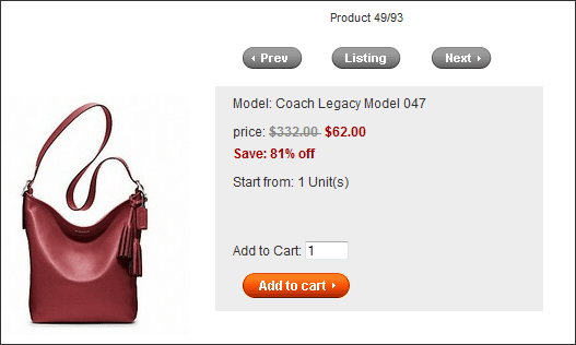
So today, she sent me a link for a Coach purse that she loves, and saw last night at a department store for $348. (My wife has expensive tastes!) But she found it online for just $62 and sent me the link. Go ahead and check it out at http://www.bagsfromcoachoutlet.com/new-coach-legacy-leather-duffle-silver-black-cherry-bag-p-2832.html
Now I hope your site doesn’t have all of the question-raising signals as this one, but let’s take a look at some of those signals now. If your site has just one of these, figure out how to fix things now.
(Note: to be clear, it is painfully obvious that this example site has no affiliation with Coach whatsoever. While I will be getting pretty critical of the web site above and its operators in this post, none of that criticism is intended to Coach or its operators.)
URL/Site Name
In this case, the URL of the web site is bagsfromcoachoutlet.com, and it calls itself the “Coach Outlet”. It proudly displays the Coach logo in the upper-left corner. All of these things indicate (and I would bet, are intended to indicate) that this site is part of the Coach umbrella. That is, that it is owned in some way by Coach. A little investigation shows that it clearly is not.
While most casual shoppers may not be savvy enough to do that kind of investigation, if you’re representing yourself as something you’re not, you are being unethical. And that always ends up showing itself and dramatically reducing your conversion.
If you sell one brand exclusively and are not part of that brand’s actual company, you should make sure this is very clear right away. Even though you are allowed to sell those products and have a relationship with the brand, it needs to be very clear to your customer that you are not that actual brand or company. Label yourself clearly as “an authorized reseller of BrandX items” or whatever your actual relationship is with them, so there is no misunderstanding with your shoppers. This will improve Trust up front, and reduce any negative reviews on third-party sites after purchases.
Prices
We already discussed that my wife was excited at the fabulously low price. In this case (the site itself listed the “regular” price as $332), an 80% discount tends to fall into the “too good to be true” category.

If your price is marked down to super-low levels, explain how you can do that to ease customer concerns about your legitimacy.
If your price really is that much lower than comparison prices, be sure to justify why that is. Is it a discontinued model that has been replaced with an updated version? Is it a “second” or slightly damaged version? Is it used?
All of these can make the deep discount totally legitimate and result in many satisfied customers. But if they think they’re getting the real thing and they don’t, you’re going to have a lot of disappointed customers who will share their experiences on the web. (In the example case, there are many customer reviews claiming that they received knock-offs, and damaged ones at that.)
Shipping
How informative is your Shipping Policy? Does it list the different shipping options that are available, and how shipping costs are calculated? Does it list the carrier(s) used? Does it give an expectation as to the amount of time it will take for your product to arrive? Does the information in your shipping policy support or justify the shipping cost?
In my wife’s example, shipping on all orders is $20 per item. That seems pretty high to me for a purse. Clearly, this is another place they make their money. There is no information on the site that explains why the shipping cost is so high.
The Home page does say that delivery time is 5 to 12 days, which is a pretty wide range. Legitimate stores have a much better knowledge of how long it typically takes customers to receive orders. The Shipping page does mention a carrier, although one I’ve never heard of.
Grammar, Spelling and Typos
Now this is something that the Shipping page (and most every page) at our example site does have a lot of! With all of the true email scams of the past few years, online shoppers are much more aware of typographical errors, spelling errors, grammar errors, or just broken English on a web page. In email, those are immediate warning signs that the message is not legitimate. These perceptions carry over quickly to a web site that someone is not familiar with.
At our sample site, there are sentences such as
“Our products find a good sale in USA.”
and
“We believe it is worthy for you going through our website,if interested,pls contact our salespeople.”
The second sentence on the Home page reads, “And all of express shipping company are very busy, we can’t make sure shipping on time.”
So your site (hopefully) doesn’t have text that full of issues, but proof and re-proof it for errors. Even if you think something is no big deal, a simple error could raise a flag in a visitor who was considering buying, and send them elsewhere. Vigilantly correct all errors in your copy as soon as they are uncovered.
About Us Page
If someone is uncertain about a store, the About Us page is one of the first pages they go to. And here’s the thing. People don’t go there to talk themselves out of a purchase. They go there to talk themselves into one. They go there to reassure themselves that this is a legitimate business, to find some information to support that they are safe to shop with you. This makes leveraging your About Us page for Trust a lot easier.
The About Us page can be used for several different purposes, but in terms of building Trust, try to include as many of the following elements as possible:
- Physical address of your store or headquarters
- Picture of one or more of your physical stores, or your office building
- Phone numbers, emails, or other methods to reach someone directly
- Owner/Leadership information with pictures
- Seals & Badges of trade organizations and security credentials
- Story/History of the company
All of these things go a long way to setting a customer’s mind at ease when they are uncertain about you.
At our example site, not a single element in the list above is included on their About Us page (or anywhere on the site that I could find). The first two paragraphs talk about Coach, again to falsely try to associate the site with the brand. The rest of the page just repeats over and over that they are very good and reliable. Note that saying that you are trustworthy was not one of the elements above. Saying that you are trustworthy just creates concerns about Trust with your visitors.
Contact Us Page
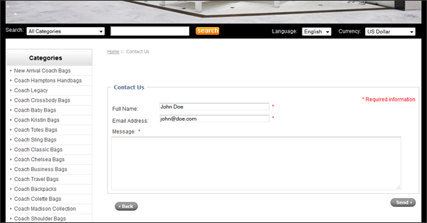
In our example site, the Contact Us page has only a very short form for you to leave your name and email address with a box for a question. There is no actual contact information. No phone number. No email address. No physical address. Nothing to even give you an idea of what country they are in.

Contact Us pages with no contact information reduce Trust
If you want your shoppers to be confident in shopping with you, don’t withhold information like this. If your operation is so small that you can’t staff phones all the time, at least give them an email and a physical address to ask questions. And even then, if you don’t have a phone number, you’re losing a lot of sales. At least have a phone number that goes to a voice mailbox and alerts you that there is a call that you can return quickly.
When customers do contact you, respond to them as quickly as humanly possible. I did not try sending a message to this site, but if messages are not returned quickly and professionally (see section above about grammar and spelling), people start to get concerned.
Types of Payment Accepted
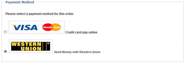
This web site accepts only Western Union, and Visa. No MasterCard, no AmEx, no PayPal. But you can use Western Union.

This site only accepted two forms of payment–Visa and Western Union wires.
We all know that accepting more forms of payment will increase conversion. What isn’t discussed as much is the positive effect on Trust you get from offering more payment options.
Note: Offering a payment option that requires the buyer to visit a third party retail branch and wire the store some money is probably not a way to build Trust. Just skip offering that option.
Remnants of the Default Shopping Cart Configuration
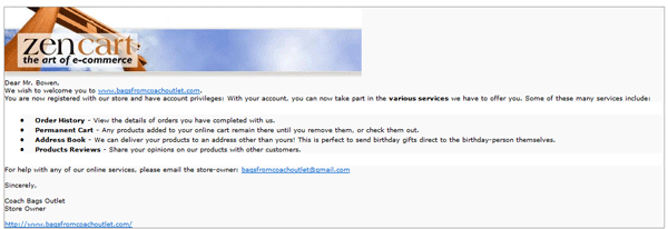
I just had to place an actual order at this site to take in the full experience for myself. I got a chuckle when I received my order confirmation email. It had the default Zen Cart image at the top that is part of the default Zen Cart setup.

The confirmation email still had the default Zen Cart graphic in it.
No one expects a legitimate store to not take the time to fully configure & implement their shopping cart software. It’s one thing to have a “powered by” link at the bottom of the page that your software requires. But to not take out the default graphics and text from the initial shopping cart configuration just tends to make visitors start wondering about you.
Conclusions
I understand that today’s example is an extreme one, and I apologize to my wife for making an example of her. (I guess now she does deserve an expensive purse for Christmas!) But my point is that even a well implemented online store can be susceptible to some of these issues. And having just one or two can raise enough flags to lose some sales.
So take a fresh look at your store. Don’t just limit yourself to the list above. Ask friends to go to it and look around as well. Ask them and yourself what might be cause for concern that a buyer might not get what they expect. And then take action to remove those concerns!


