For seemingly straightforward tasks, such as signing up for a company’s loyalty program, many lay people probably think an effective User Experience (UX) just takes common sense. But designing a good UX usually requires much more thought. Many facets of a good UX, such as maintaining a consistent message from ad to landing page, ensuring that you have sufficient offline resources to support the added interest from the website, and performing the right testing, are often forgotten in many new implementations.
Let’s look at an example of a registration process that is experiencing some issues, and how it can be improved.
[UPDATE: I did eventually hear from Loews trying to help me. See the update below.]
Loews Hotels YouFirst Loyalty Program
I’m speaking at the User Experience Professionals Association (UXPA) annual conference coming up June 22 – 25, to be held at the Loews Coronado Bay Resort near San Diego. This will be a fabulous conference at a beautiful location. The Loews Coronado Bay looks to be a beautiful venue and I’m excited to attend.
Not long after booking my room for the event, I received an email from Loews to join their Loyalty program, called YouFirst Rewards. I generally join all programs like this, so I was pretty happy to receive that email. Here’s the email Loews sent me:
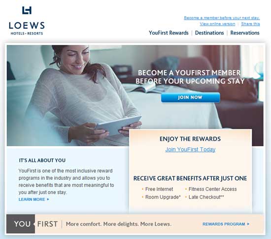
The email I received from Loews Hotels, suggesting I join their loyalty program. This is a pretty well-done email with a clear and strong call to action.
This is a good email. It’s brief, it displays reasonably well on mobile devices, and the call to action is clear.
Always Maintain the Scent Trail on Landing Pages
I clicked the primary call to action in the email, the nice blue “Join now” button in the image, and this is where the experience started to get worse. Clicking that button took me to this page:
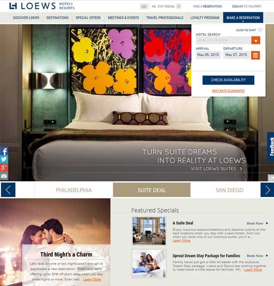
The destination page from clicking the “Join Now” button from the email. This is just the Home page of the Loews site, and does not talk at all about the YouFirst Rewards program. (Click to enlarge)
This happens to be the Home page of the Loews Hotels website. I was expecting to come to a page that talked about the YouFirst Rewards program, either with a form right there to start my signup, or at least another call to action to take me there.
A key concept in Landing Page design is what’s known as “Maintaining the Scent Trail”. That is, the message from the source (such as an ad or in this case, an email) should be reinforced on the landing page the visitor is taken to. This can be done with things like repeating headlines, graphics, etc. If there is an offer involved, it should definitely be repeated on the landing page. You want to set the user at ease that they have come to the right place, and make it simple for them to complete the conversion.
In the Loews case, that could be so simple. I could have been taken to a landing page that repeated the headline “Become a YouFirst Member Before Your Upcoming Stay” (or at least “Become a YouFirst Member”). It could have used the same graphic of the woman on her tablet, or a version of it that would fit the web page. And the sign-up form could have been right there on the page.
In a worse case, but still acceptable, I could have been taken to the regular home page of the YouFirst Rewards program, or the regular sign-up page for the program. Neither of those might use the same imagery or headlines, but it would still be clear I’m in the right place.
In this case, however, I was left stranded on the Home page of the site, left to fend for myself and see if I could find the sign-up form on my own. It’s important to note that many visitors, even many who felt motivated to sign up, as I did, will leave at this point. They’ll leave because they don’t have much time to look around for the next step, or because they’re confused, or with plans to come back later, or just because they don’t have such a warm feeling now. You’re making them work.
The YouFirst Rewards Page – Where’s the Call To Action?
I actually did close out this page that first time, as I didn’t want to take the time to look for what to do next. But a couple days later I stumbled across the email again and decided to try again. And this time I did notice the “Loyalty Program” tab in the main nav. Again, wording can mean so much, and using “YouFirst” in that tab might have made it easier for me to notice the first time, since that was the wording in the email.
So I clicked that tab and was taken to the home page of the YouFirst Rewards program. It looks like this:
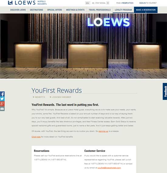
The main YouFirst Rewards program page on the Loews site. There is no real call to action to join on this page. There are two tiny links to the sign-up form. Can you find them? (Click to enlarge)
This is an okay page, but again, it could be improved quickly. I imagine that the primary objective of this page is to get people to sign up for the program. However, the call to action for this is far from clear. Again, they’re making the visitor work to find it. It’s there, just below the “YouFirst Rewards” page title (“Join/New Member” link). It’s actually more of a sub-navigation link than a Call To Action, as it sits next to another sub-page of this section of the site (“Benefits”).
It is not located where many people will look for the next step in a process. It is colored and styled the same as most of the other links on the page. It is not worded as a directive or anything to really entice me to click it.
There is also a very small link within the body text of the page that will take me to the same page. Neither of these are easy to find. Neither are intuitively located. In fact, the eye is mostly drawn to the white box with Reservations and Customer Service. I’m sure that reservations are nice, but I’ve already made a reservation. That’s why I got the email and why I’ve tried so hard to join the rewards program. The focus of this page is all wrong.
The Actual Sign Up Process – Even a Good Form Can Have Problems
Fortunately, I did eventually find that link at the top to try to sign-up. I clicked it and was taken to the New Member Application page. The page begins with “Becoming a YouFirst member takes no time at all.” That first line turned out to be a little ironic.
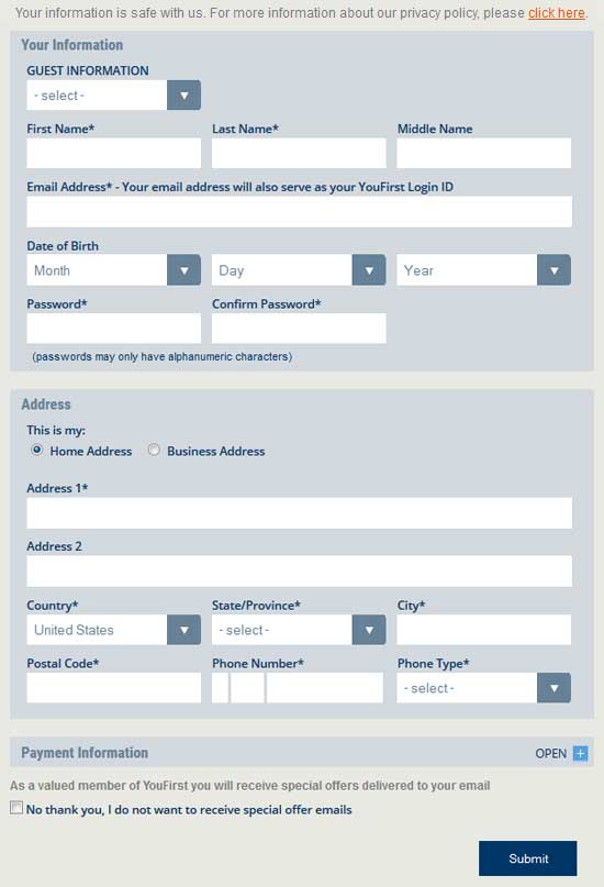
The sign-up form to join YouFirst Rewards. That they call out the privacy policy up front is excellent, as is the clear explanation of password guidelines. Most importantly, the form is not so big it is overwhelming. The Phone Number boxes, however, can be confusing.
This is not a bad page at all, in my opinion. There is necessarily a good amount of data for me to fill out to join, but the form still looks reasonably brief. That’s important, and well done. I also really like that they assure me at the beginning of the form that they keep my personal information safe, with a link to their privacy policy. They also state the requirements for a valid password right on the form, so I don’t risk entering all my information and getting an error back that my password doesn’t meet their guidelines. All that is great!
There are a couple things I’d improve on though. First of all, I’m not a fan of “Confirm Password” boxes. It’s more to fill out, and if someone did make a mistake entering their password, they can always use a “Forgot my password” link to get it reset. It just makes the form longer and more intimidating.
Second, the Phone Number section could be confusing to many people. Is that first box for some sort of international code? It’s too small for an area code, and I think too small for an international code as well. I tried leaving it blank, but got an error saying it was required. Many people won’t know what to put in there. I ended up putting in a period.
Technical Issues – You Must Be Bug-Free
Having filled out the form, I clicked on the “Submit” button (which could have more enticing text on it than “Submit”). Doing this dropped me into and endless “wait” state while the system supposedly tried to look up my account. I’m signing up for the first time, so I’m pretty sure they won’t find an account. Maybe this is the problem, because I never got this message to leave my window. And you can’t do much of anything else there. That message appears in a modal, blanketing the entire page. All navigation choices are covered up. I can do nothing from here but wait.
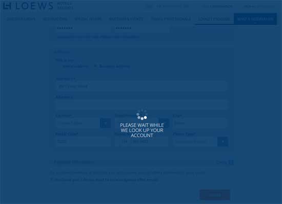
When I submitted my form, this is what I saw… forever. There was no way to go back except to just close out the tab and give up.
And wait I did. Forever (or at least what forever is equal to in a virtual world). I actually tried this a couple more times over the course of a week with the same results. Is this situation caused by me? Was there an unexpected entry in my form that the system can’t handle? Perhaps that period in the first part of the phone number? I would hope not! But even if so, leaving the customer in a void is hardly the way to build up loyalty in a loyalty program.
Offering Help – Chat Now (Now?)
I think the vast majority of people would have given up at this point. The few who might come back a couple days later as I did would certainly quit after it breaks a second or third time. I kept trying, however, in part out of curiosity. What more could I learn from their UX at this point?
This time I navigated back to the form, but instead of trying to fill it out, I clicked the “Chat Now” button at the right side of the page. Doing this gave me a short intro form asking for the hotel I was inquiring about, my name, and my question to start the chat. I’m not actually inquiring about any hotel here, but I figured I’d choose the Coronado Bay Resort anyway. For my message I just said that I’m having troubles creating my YouFirst account and was getting a little frustrated.
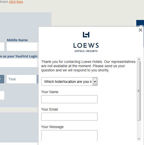
The chat option gave me one last hope of getting signed up.
I clicked the “Submit” button (again, how about something like “Start Chat”?) and waited for my representative to respond. Once again, my hopes were dashed. All I got was a message that said “A live representative will respond to you shortly.” By “shortly”, I guess they meant sometime tomorrow, because I left that box up on my open browser for the rest of the day to see if anyone would ever respond. Nobody ever did. They did not ask me for my email address, so I know they won’t be emailing me a response.
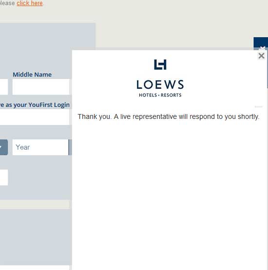
I never did get a representative to chat with me.
I remain a YouFirst wannabe, on the outside looking in.
[UPDATE: I did eventually hear from Loews! Six days after trying to initiate that chat session, I did receive an email from a person at Loews explaining that they had been “experiencing technical difficulties with the Your First website” and apologizing for the delay in responding. She said she had received my Chat inquiry and offered to get me signed up for the loyalty program if I would email her my information (which I did). I have no idea how she had my email since it was not part of the Chat form. And while one might suppose that that email was more a result of this blog post than the Chat attempt, it was not. That email came to me actually just a couple hours before this blog post went live. So props to Loews for recognizing the issue and trying to rectify it (although slowly).]
This Could Have Been So Much Better
The last thing a Hospitality Company needs is a less-than-hospitable website. But that’s pretty close to how I felt about the process of trying to sign up for the YouFirst Rewards program. Not all people would feel the same, but it’s fair to say that many would. How could this have been avoided?
The answer is simple: perform some usability testing on the process before launching it. I’ve blogged about usability testing before. Essentially, it involves watching strangers try to complete some simple tasks on your site, and noting where they have troubles, or express resistance to completing the task.
I really think that complete, moderated usability studies are the best value going in terms of improving a site’s conversion rate. But in this case, where there is just one pretty specific task involved, Loews could have likely identified all of the major problems just through simple unmoderated user tests utilizing a company like UserTesting.com. For two or three hundred bucks, they could have had four to six people go through the process of receiving the email and trying to sign up, much like I did. I definitely think that each of these problems would have been experienced by more than one of those testers:
- Troubles finding the loyalty program after clicking through from the email
- Troubles finding the actual sign-up page once they did get to the YouFirst page
- Difficulties figuring out the three-field phone number box on the sign-up form
- The technical issue of the form submission form just locking up and not being able to recover from it
- The chat request going into a black hole where nobody responds
I imagine that Loews thought that they did test this application. The developers probably did several test registrations and pronounced it all sound. The problem is, when you’re that close, you know the system inside and out, and you have a set way you go through it that you know works. You don’t realize you’re doing this, but you do. People very close to the system don’t realize there are other assumptions common users are making (or not making) that differ from their own. So their testing doesn’t uncover the actual bugs.
Are you about ready to release a new component to your website? Have it tested before you launch it to the public and start frustrating would-be customers. Contact Web Site Optimizers to go through different options to find a solution that will meet your needs. We’ll make sure that your release leaves your customers smiling & happy.


