These days, it seems that TVs and restaurants go hand in hand. In the past week, I’ve counted nine restaurants that I’ve eaten in (okay, my family eats out way too much!), and all but one of them has had at least one TV outside any bar area. (That one that didn’t was the restaurant inside a hotel.) All of them were turned on, and there was always at least one visible from whatever seat we were sitting in—even at a McDonalds.
This post isn’t about whether TVs in restaurants are good or bad. I imagine they do something toward earning extra revenue for the restaurant in some way or another. But it’s true that I don’t like them and try to sit in a seat that does not look at a TV, and here’s why.
People Can’t Stop Looking at the TV
No matter how hard I try, I can’t avoid looking at the TV. Whether I’m with my family, a client, or just a friend, I’m in the middle of a conversation valuable to me. I don’t like how it looks if I’m constantly glancing away at the TV. And typically, the TV is showing something I have absolutely no care about whatsoever. Yet I can’t stop looking.
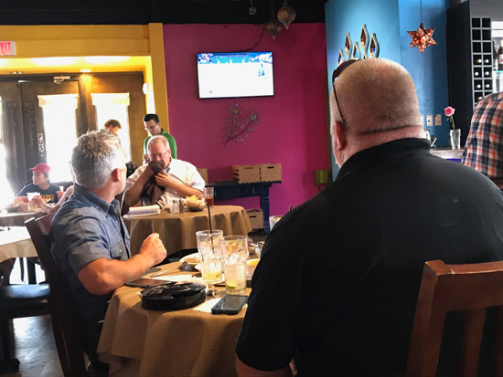
No matter how yard you try to ignore it, the motion of the TV will draw your attention.
And it’s not just me. Next time you’re out to eat (the restaurant is sure to have a TV nearby), look at the tables around you. How often do people pay even just a quick glance to the television while they are in conversation with someone at the table? Look and see; it’s pretty constant.
See that couple at one table that is clearly on a date? He’s wearing a jacket, and she a nice dress. They are smiling at each other. Each is trying to make a good impression, trying to show that they have interest in the other. But one or both keep looking up at that darn television set without even wanting to.
What Does This Have To Do With Website Optimization?
Actually, a lot. What’s going on here? What is this thing I call the “TVs In A Restaurant” Syndrome? It has to do with the fact that people just can’t ignore moving pictures. It’s part of our evolutionary past that we just can’t get around. And just as a moving TV picture can prevent me from focusing on my conversation at the restaurant, motion on your landing page can steal attention from the more important elements of the page, such as the Call To Action.
The Reptilian Brain
 In his definitive book, Landing Page Optimization, Tim Ash describes “the reptilian brain”, that part of the brain that has been part of us the longest, back to our reptilian days from an evolutionary standpoint. This part of the brain is “responsible for physical survival and maintenance of the body” and the part that “takes over in fight-or-flight situations.”
Tim wrote an article way back in 2012 about the perils of rotating banners on a page, noting among other things that “Motion in a scene triggers the reptilian portion of our brain. This occurs at the level of automatic survival instinct and cannot be avoided. Frequent motion changes in a part of the page keep stealing the visitors’ attention and make it difficult to visually prioritize or to consume any other content on the page.”
What Part Of Your Site Is Triggering The Reptilian Brain?
Look at the most common landing pages (and most commonly viewed pages in general) of your website. What are the most important elements of those pages? Hopefully, each has a clear Call To Action to entice visitors to take the action you hope for. This is where you want your visitors’ attention to be drawn. Make it stand out. Make it be noticed. Other elements such as a clear communication of the value proposition are critical components as well.
Now, what do you have that is taking your visitors’ attention away from these page elements? Do you have motion, either in terms of a conversion-killing rotator/carousel or some other kind of rich-media? Do you have pictures of people in other areas of the page? That reptilian brain is trained to focus on motion and faces.
Elements like these will take the visitors’ attention away from your more important areas of the page. Just as that TV is stopping me from giving all my focus to my dinner mates, try as I might. That couple on the date in the restaurant are trying to do all the right things to attract and show interest in the other. But they can’t overcome the instinctive need to look up at that TV.
Take The TVs Down And Drive More Conversions
As I said above, I imagine the studies have been performed that indicate that TVs in a restaurant result in an increase in revenue (at least I hope the restaurant owners know this to be true!). But I also know that the distractions caused by motion on your website will also usually result in fewer conversions. If you don’t feel this is so, at least test for it to find out.
If you don’t want to test, then remove those rotators, that automatically playing video, the image faders. Get rid of the animation on your pages, and direct more attention to the conversion areas of the page like your Call To Action. Then watch your conversions start to increase.
