I get a lot of questions and inquiries these days as to whether someone’s website is “mobile-friendly” (or “mobile-ready”, “mobile-optimized”, etc.) Just last week I was in a meeting with a client and another vendor where the vendor asked if their site was mobile-friendly. My client quickly and proudly replied, “Yes, we paid extra for that!”
Before things got too far, I made sure to interject that in my opinion, no, the site was not mobile-friendly. That kind of got the meeting sidetracked a bit. My client was a bit taken aback. “If you call up the site on an iPhone, it comes up, it all fits on the screen, you can order products from it. Certainly it is mobile-friendly.” I still disagreed. Why? What was the cause of this disagreement? Who was right?
What Does “Mobile Friendly” Actually Mean?
Part of the problem comes from the fact that we are talking about a term that has no specific definition. It’s like calling your company “green”—the definition can be in the eyes of the beholder.
Terms like Mobile-Ready, Mobile-Optimized, or Mobile-Friendly are qualitative terms that have no official standards that must be met in order to earn the title. (In fact, what is the difference between those three terms? Ask five people and you might get five different answers. For this post, I’m considering them all to be the same.) Whether you consider a site to be mobile-friendly depends on what your objectives are for calling it such.
Is This Really That Important?
In a word, yes. You certainly know by now that mobile usage of the web is exploding in areas many thought unlikely just a couple years ago. According to a study by Invesp Consulting, 62% of all smartphone users purchased physical goods from their phones in the last six months, and by 2015, 81% of all US cell phone users will own smartphones. The same study shows that three out of every four online retailers have already developed a mobile strategy, or are in the process of doing so.
Still not sure how the mobile explosion is affecting your site specifically? As usual, the answer can be found in your analytics. Look and see what percentage of your users are mobile users. How does the conversion rate and average value compare for mobile users vs. non-mobile users? How much more value would you get if your mobile conversion rates were the same as desktop?
Consider a small store selling $10,000 of product per month, with 25% of their traffic being mobile. Their overall conversion rate is 2.5%, but it’s only 0.75% for mobile users. Finally, suppose that the average order size is about $50 in either case. If that company could get the mobile conversion rate to match the desktop conversion rate (which is a little more than the overall 2.5% rate), it could earn them an additional $2300 per month. That’s nearly a 25% boost in revenue just by making the site mobile-friendly.
And remember, their mobile traffic is only going to grow.
What Makes a Site Truly Mobile Friendly?
In the example above, the website “works” on a mobile phone. That is, the entire width of the site is visible within the viewport of a standard smartphone. There is no Flash that leaves gaping holes in the site when viewed on Apple mobile devices. Technically, the navigation and shopping cart system function on a smartphone without technical glitches. In my client’s eyes, this meant that the site was mobile-friendly.
My objectives for the site were slightly different, however. My focus is maximizing online revenues by optimizing the experience of all users of the site. That experience is pretty good for desktop/laptop users, and close to that even for tablet users. However, it came up short for essentially the same reasons that most sites are not mobile-friendly.
Size of Photos and Text
It’s true that the web site we were discussing does “fit” on a normal smartphone. But so do almost all sites. Smartphones are indeed smart. They know how to shrink a website so that it “fits” within the viewport. However, if most sites are simply shrunk by the phone to fit within the viewport, the result is generally that you cannot read the text or make out details of a photo without “pinching” to zoom in on the page. And of course, once you do that, the page does not fit inside the screen, and your users need to start scrolling horizontally and vertically to use the site. That’s not a good experience.
Truly mobile-friendly sites adjust the layout so that photos and text are still rendered large enough to view and read without the need to zoom. This usually means reformatting the page so that non-critical elements such as sidebars are repositioned or removed entirely.
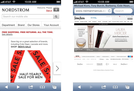
For example, pull up the site of high-end retailer Nieman Marcus online (below right). The page fits on the screen, but the text is pretty small. You can turn the phone horizontally to make things a little bigger, but then the main graphic extends below the bottom of the screen, cutting things off. The page looks just as it does on a desktop—just smaller. People will probably have to pinch to zom, which begins to make the site more difficult to use on a phone. (The screen shots that follow are displayed fairly close to actual scale, although you’ll tend to be reading much closer to an actual phone than to your computer monitor.)

The Nieman Marcus website on an iPhone (right) is just a shrunken version of the standard site. Text is too small to read, and photos are too small to make out many details. Nordstrom (left) shows a layout designed for the different sized screen so that you can read the text and digest any photos.
Compare that with the site of another retailer, Nordstrom (above left). The text is bigger. The navigation is easy to tap (see below). The main image extends below the bottom of the screen, but all of the relevant information of that graphic is visible.
If you look at the Nordstrom site on your desktop, you’ll see that it is laid out differently. Both layouts are tailored for the device on which they are being viewed.
Completely Functioning Navigation
Most sites these days have navigation areas that are more than just a simple group of text links. Mega-menus, multi-level dropdown menus, animated effects, and more are quite commonplace in navigation now. In pretty much all cases, these menus were developed only with desktop in mind. That’s fine—the desktop user should have as rich an experience as possible.
However, if those navigation methods do not work or lend themselves well to a mobile platform, then your site is in real trouble. For example, many navigation systems are based on a mouse “hover” action—something special happens when the mouse hovers over the element. This can be trickier in a touch-screen environment where there is no real hover action. For most cases, the phone can adapt fairly well with just a tap. Does it for your site?
Easy to Tap Links & Buttons
Extending the Navigation concept above further, but expanding it to all links on the site, it’s critical that links & buttons are easy to tap on a phone without accidentally tapping something else. This boils down to two key considerations when thinking about a link or a button on a smartphone: target size, and white space.
Obviously, the link or button to be tapped (the target), has to be big enough to make it easy to tap. If you see someone using your site on a phone and see that they are using their pinky finger, you know you have some targets that are too small! There are many guidelines out there about the minimum size for a button on a mobile version of a web site. I like to use Apple’s recommendation of a minimum size of 44 x 44 pixels. And if the link or button is more important, such as a call to action, you certainly want to make it larger.
White space around buttons can be equally important, especially in areas such as navigation where there are other buttons or links in close proximity. Including ample white space around your target helps the user avoid the annoyance of tapping the wrong target, waiting for the unintended page to load, and go back and try again. You certainly want at least a six pixel perimeter of white space around your target, but try to make it as much as 10 pixels when you can.
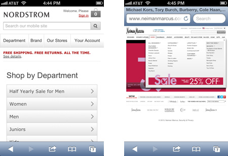
Take another look at our two example web sites. Since it is all shrunk down, the links on the Nieman Marcus site are (at best) difficult to tap. They are small and bunched together. It’s very likely that in trying to tap the “Shoes” link, you might accidentally hit the link for Women’s Apparel or Handbags. The navigation does work, but when you get the megamenu for Shoes, you’ll again have some issues accurately tapping the subcategory you want.
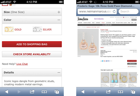
If you go to a product detail page, the “Add to Shopping Bag” button, which seems pretty big on your desktop now seems rather small, certainly more narrow than the width of your index finger. Still, it would be big enough to tap pretty easily if it were not directly adjacent to the “Add to Wish List” button. Waver just a little bit and you’ve tapped the wrong button.

The Nordstrom web site (left) has easy to tap links and navigation when viewed on a phone. The Nieman Marcus web site has links and navigation much too small and close together to be able to use effectively on a smartphone.
But look at the Nordstrom site. There are fewer choices in the navigation area, and those choices are larger and easier to tap correctly. If you go to a product page, the Add to Cart button is large, spanning most of the width of the screen. No issues here in getting to your intended pages the first time.

The Add to Bag button is much easier to tap on the Nordstrom site (left) than on the Nieman Marcus site (right) when rendered on a smartphone. The user does have to scroll down a ways to get to the button for Nordstrom, but on the Nieman’s site, it’s far too easy to tap the Add To Wishlist button by mistake.
Appropriate Downloads
Much of the time someone is using a smartphone to surf the web, they are off WiFi and using a cellular data network. If your site is full of large images that are either larger than they need to be or altogether unnecessary, it will make your site much slower to load on a phone (and it could cause your user to incur unnecessary data usage fees).
This actually applies to all elements of your site. Mobile users don’t want to wait a long time for a page to load. If there is a bunch of JavaScript in use to drive a menu system that you’ve decided to use only on the desktop, don’t load it to a smartphone. Consider leaving supplemental information or rarely used functionality off the mobile version of your site, with the option for the user to view the “full” version of your site to get to that content.
What About Tablets?
I know, most of this post has centered around the differences between phones & desktop computers. So where do tablets like iPads come into play? The good news is that most tablets have a resolution pretty similar to a decent full-sized monitor. Most are 1280×800 or greater, so your user’s experience there will be quite similar to that of a laptop user or most desktop users. Still, you do want to take much of the above into consideration, even if some of it is already satisfactory on a tablet.
For example, you’re still working with a touch screen, so it’s important to review your site on a tablet to ensure that all buttons, navigation, and links are large enough and separated enough to make them easy to tap. If not, you can probably make minor adjustments to correct this without affecting the desktop version negatively.
Do also consider what is being downloaded to reduce the page load time and bandwidth usage for your iPad users.
And as always, check your analytics to understand what percentage of your users are using a tablet to view your site to help prioritize things.
A Note About Technologies
Note that I don’t use current buzzwords such as “responsive web site”, “separate mobile site”, or other technologies that describe how your site is adjusted differently to phones vs. tablets, vs full-sized monitors. My focus here is on the experience the user sees and feels, not in how your site gets that done.
The debate can rage on about whether the “best” way to design your site for mobile devices is via responsive design, separate mobile web sites, or something else. The fact is, that answer will depend on your own individual requirements, budgets, expectations, etc.
But your initial objective should be that the user experience is as positive as you can make it. You want it easy to shop, easy to read, easy to use, whatever your desired actions are for visitors to your web site.
If your website still appears the same on a phone and/or tablet as it does on the monitor on your desk, now is the time to start putting together a strategy for optimizing your site for mobile devices.


