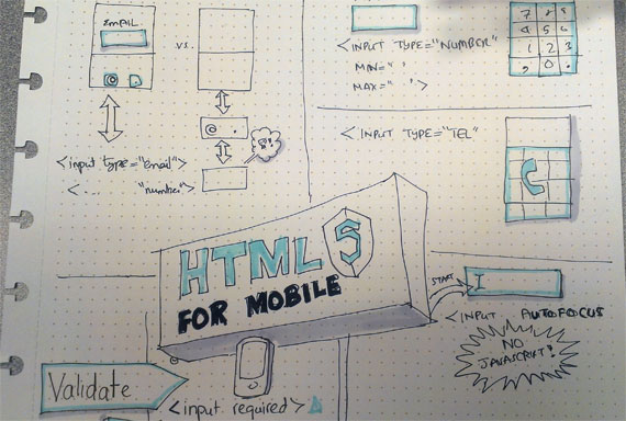
Illustration: Sherif Tariq
As you are looking for ways to improve your website, ideally to increase conversions, you’ll undoubtedly come across a myriad of thoughts and hypotheses to test. Changes can be big or small in difficulty and cost. However, there are also some no-brainer enhancements that can be made to most sites. One of those is upgrading your forms to take advantage of new HTML5 features.
Why It Makes Sense
Why are the new features in HTML5 forms a no-brainer? First, they are quite simple to implement. Even the longest form can be modified in a matter of minutes to take advantage of HTML5’s benefits. In almost all cases, everything you or your developer needs to know is contained in this short blog post.
Second, these features are supported on the vast majority of browsers today, but for people who are using old browsers, your forms will render exactly as they always have. This is completely backward compatible. So there is very little risk in making these changes.
Third, right now these changes have the greatest effect on mobile users. If your boss hasn’t spoken to you lately about making your site more “mobile-friendly”, then one of you is probably just not paying attention! Implementing HTML5 form features is an excellent beginning step toward making things easier for your mobile users.
Mobile Keyboards and HTML5
So speaking of mobile, let’s start there. Have you ever used your phone to view a website or app where it is asking you for your email address, and you’ve noticed that the @ sign is already right there on the keyboard with the letters? If you’re like me, you probably thought, “yes, smart, because they know I’m entering an email address.” You’re glad they are not making things any more difficult for you.
But then, a couple days or just hours later, you remember that vividly, because you’re on another site asking for your email, but this time you just get the standard keyboard. Now all of a sudden you have to go shift to enter the @ sign and then shift back. Seems pretty minor, but it can get annoying.
This is one place where HTML5 comes to your rescue. There are several new Input types that can tell many mobile browsers what kind of keyboard to display. Giving this kind of assistance to your users can make things like checking out or other conversion processes a breeze. It can even at times be the difference between completing the conversion or not. Even more often, it can mean the difference between a positive experience where the user will come back in the future, versus a negative one where they will not.
Here are some of those new Input Types.
Type=”Email”
Since we started by talking about emails, let’s finish the example. Today, if you are asking for an email on your form, you probably have a line of code that looks something like this:
<input type="text" name="custemail" />
Yours may have some other attributes in there, and might also not have the “type=’text'” as text is the default. This snippet of code puts a simple text box on the screen into which the user can type an email address (or any other piece of text they choose). On a smartphone such as an iPhone, tapping in that box will bring up the generic keyboard.

Standard iPhone keyboard
Using HTML5, however, you could change that code to this.
<input type="email" name="custemail" />
For most browsers, this change won’t look any different. But for that iPhone (and most other smartphones), when the user taps in the box, they will get a different keyboard—one with the @ sign and the period right there, eliminating the need for shifting.

The keyboard for a type=’email’ input has a smaller space bar (since there are typically no spaces in an email), and an @ key and a . key.
Your customer is now much happier!
Type=”URL”
This works very similarly to the email type. Most browsers will display this just as the standard text box. However, for smartphones, when the user taps on the box, they will see the URL keyboard, which includes the period, the slash, and typically a .com key.

The keyboard for type=’url’ form fields is tailored with the keys most used in URLs.
Type=”number”
This one has a bit more functionality than type=email or type=url, but in its simplest form, it does what you might think. It shows the numeric keyboard when the user taps it in a smartphone.

Type=’number’ defaults to the numeric keyboard on iPhones.
The code for that could be as simple as:
<input type="number" name="quantity" />
The Number input type also has some optional attributes: max, min, and step. These are primarily used for validation purposes, but on some browsers (Chrome is one example), the Number input type will be rendered with little arrows at the right side of the input box to allow you to click through to increase/decrease the number you are entering.
So for example,
<input type="number" name="quantity" min="12" max="144" step="12" value="24" />
would render a box that would allow your user to quickly click to increase/decrease their quantity in increments of a dozen, up to 144.

Some browsers, such as Chrome and Opera, display type=’number’ inputs with up and down arrows to allow the user to increment with the mouse.
Type=tel
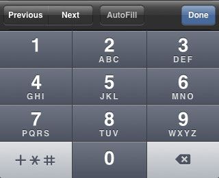
This input type is similar to the minimal usage of the Number type. However, whereas type=”number” brings up the numeric keyboard shown above, type=”tel” brings up the telephone keypad. This essentially limits the user to just the 10 digits 0-9, the plus sign (+), the asterisk (*), and the pound sign (#).

Using type=’tel’ will show a keyboard with just 13 different characters.
Remember! Only on smartphones (and not all of them) is the user limited to those numbers. Most desktop browsers will render this the same as any other text box, and will allow any characters to be entered into it. Even on a smartphone, a user could still paste in non-numbers. The restriction is simply in the keypad.
The Tel input type can be useful for purely positive integer fields such as ZIP codes, and of course, phone numbers.
Autofocus
Setting the focus of a form automatically to the first field of the form can be a way to make things much easier on the user—especially users who like to move from field to field with the tab key (and there are lots of those users). Setting the focus automatically allows them to not have to take a hand off the keyboard to use the mouse.
Unfortunately, most forms do not do this. And many that do actually hurt the user experience because they wait for the page to fully load before placing the focus, and the user has often already begun filling out the form by then. When the JavaScript moves the focus back to the default field once the user has begun filling the form out, at best it annoys the user. At worst, it submits bad data.
With HTML5 comes the ability to set the focus to a field in the form without any messy JavaScript, and it sets it immediately. Your user won’t “beat” it. It’s so simple. Just add “autofocus” to your input element like this.
<input name="username" autofocus />
If your forms do not currently use JavaScript to automatically set the focus, I urge you to go add that one word—autofocus—to the first field of the form. Your users will be happier. Older non-HTML5 browsers will not support this, but again, things will behave exactly as they do today for those users. And the number of those browsers in use is shrinking.
If you do have JavaScript code in place to set the focus, I’d recommend you look at your metrics to see what percentage of your users are using older, non-HTML5 browsers. If the percentage is low, consider replacing the JavaScript method with the HTML5 attribute. If there are a lot of users with older browsers, you might want to consider modifying your JavaScript to test for support of autofocus, but that is beyond the scope of this post.
Form Validation Made Easy
Hopefully, your forms currently have some form of validation. Form validation consists of checking to make sure that required fields are entered, but also that certain fields meet a certain format. For example, that a ZIP code field be all numbers, or that an email field look something like xxxx@yyyy.zzz.
You should be thoroughly scrubbing for validity like this on the server side where the form is received. But you should also be checking at the browser so that things you know are bad right away aren’t sent up to the server to begin with.
However, in many cases, developers simply verify that required fields are filled in, and leave things for the server to make sure that the provided data is actually useful.
HTML5 comes to the rescue again for certain form types. The input types mentioned above (email, url, number, and phone) all come with built-in validation. So if you just enter websiteoptimizers.com into an email type field, an HTML5 compliant browser will throw you an error message instead of submitting the form. You’ll have to make it something like info@websiteoptimizers.com.
The same goes for the other input types mentioned above. The Number type will also validate that the number is valid within the range you specify in min and max attributes, if you do specify them.
If you already do have a great form validation JavaScript function set up that is running correctly, that’s great. You should still use those new input types. Just put “novalidate” (without the quotes) in your <form> tag so that it can run your validation script instead.
<form action="formsub.php" method="post" novalidate>
If you aren’t doing any client-side validation such as with JavaScript, or are only ensuring that required fields are being submitted, using the Input types listed above will improve your form submission process, and make things easier on many of your users.
Positive Experience = Happy Visitors = More Conversions
These are changes you can make, easily, right now. Unlike most changes, you don’t need to run A/B tests on them to make sure they’re positive changes. They are truly no-brainers.
Will they increase your conversion rate by 10% or your average order value? Probably not. One reason you don’t need to test them is that they probably won’t make a huge difference—especially not right away. But they will make your visitors happier, even if they don’t realize it. And creating happy visitors is an investment—one that does tend to pay dividends over the long run.
Make your site as easy to use as possible, and the people who use it will like it more. They’ll return more often. They’ll recommend it more to their friends. And people will convert more over time.


