 I’m still surprised by the large number of businesses I talk to that are not using email marketing much, or at all, despite the fact that it’s just about the least expensive and most effective e-marketing tactic that they can utilize. And I wonder, is it simply because they find the results of a campaign confusing? Just in case, let’s do a quick review of the key metrics in most campaigns. If you have numbers from a recent report you’ve been ignoring, get it out and go through it as you read this post.
Sent To
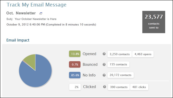
You know I like to start easy! This should be pretty straightforward. It is the total number of unique email addresses that the campaign attempted to send to. The key words here are unique and attempted. If your distribution list was culled from multiple sources, the same email address might appear more than once, so the Sent To number is not necessarily quite as large as the total list you submitted. And of course, in most cases, some of these will not be valid or for some other reason will not deliver. So Sent To is different than Delivered (see below).
Bounces/Bounce Rate
In most cases, less than 100% of your intended recipients will actually receive the message. You could have some old emails in your list that are no longer valid. Or their inbox could be full. Or there mail server could be down when you try to send to them. There are many reasons an email is undeliverable to someone, and when this occurs, it will bounce back with an error. (Note that this is different than an out-of-office auto-response. That is not a bounce back.) So the total number of bounces is the number of messages that were rejected and sent back. If you Sent To 100 recipients and 4 bounced back, that’s a Bounce Rate of 4% (Bounces divided by Sent To).
Total Deliveries
This is simply the number Sent To less the number of Bounces. It is used as the denominator for things like Open Rate (below). In our example above, with a Sent To number of 100 and 4 bounces, you had 96 Total Deliveries.

Inbox Placement Rate
We know how many messages successfully made it to the mail server, but in many cases, the intended recipient may never see it. It can get delivered straight to the recipient’s “junk” or “bulk” folder. Or, that person’s mail server may just ignore it if it thinks it is really spammy looking. That’s different than a bounce-back since the server likely won’t send an error back to the sender in this case. In any case, it is difficult to measure how many of those Deliveries actually make it through the spam filter. Some services do attempt to measure this using complicated methods such as “seed lists” or “panels” of known emails. The bottom line is that if your Email Service Provider (ESP) is giving you an Inbox Placement Rate (the percentage of messages that do make it through the spam filter), it is just an estimate. But just because it is an estimate, don’t ignore it. It’s a very valuable metric to have, both for improving the deliverability of future messages, and for getting a better understanding of which messages are truly being opened and clicked through more or less frequently.
Opens/Open Rate
The number of Opens is simply the number of times the message was opened. Your ESP should give this to you in absolute and unique terms, but unique is most important. So in our example above, you might have 41 opens, and 28 unique opens. This means that they have identified 28 different recipients who opened the message (and some did it more than once, to a total of 41 times). For the purpose of the rest of this article, when I refer to “Opens”, I mean Unique Opens.
Note that I said that the ESP has “identified” 28 who opened it. That is really a minimum. There will be some people who opened it that were not tracked? Why? Well your ESP is able to measure the opens by including a small graphic in the message, and then looking at their server logs to see how often, when, and for whom, that image was served. But some people (myself included) have their email client set to NOT load graphics by default. If I open your message, my open will not be logged unless I’m intrigued enough to click the button in Outlook to download the images. Many people have their phones set to not download images to make it faster or to not add to their data plan needlessly. So again, Opens is a bit of an estimate, or a minimum.
Open Rate is simply the number of Opens divided by the total Deliveries (29.2% in our example above). Campaigns with higher Open Rates demonstrate a higher level of engagement, and greater chance of click-throughs. (Here is more information on improving the Open Rate of your campaigns.)
Clicks/Click Through Rate
Most likely, your email contains at least one link (or several) to your web site in the body of the message, as that’s typically the objective of the campaign. So you definitely want to know what percentage of people did click through to the site. Your ESP should give you this number, again in Total and Unique terms. And again, Unique is the number I’m mostly interested in.
The Click Through Rate is the number of unique Clicks divided by the Total Deliveries. Some people will measure it by dividing by Opens instead of Deliveries. This is fine if you are consistent with that, but typically we define it as a percentage of Deliveries.
Conversion Rate
Okay, we obviously have reason to know how many people opened and clicked through on our messages, but in the end, there is a more important action we want them to take—the conversion. It could be making a purchase on your site, or making a donation. It could be downloading a White Paper or an Infographic. It might be filling out a lead form or placing a phone call. In the end, it all leads back to conversions. High Open Rates or good Click Through Rates are great, but if you can’t measure how many are taking your true desired action, then you’re wasting your time.
And here’s the rub. Your ESP probably won’t be able to tell you what the users did after clicking through. That’s on you (or your analytics person). One way is to have all links in the destination go to isolated landing pages (designed to convert). If that landing page was part of a completed sale’s path, then you know it came from one of the emails. Another way is to tag each link in the email with a parameter so that it can be tracked on the web site. Or you can even do things the old-fashioned way and look at the name and/or email associated with the conversion and see if it ties back to a click-through from your email. More tedious, but still effective!
As I say, if you’re not measuring this on your email campaigns, you’re pretty much wasting your time. I’m not saying that the emails won’t be effective. I’m saying you won’t know if they’re effective. And if you don’t know, you don’t know what needs to change. You won’t know if the call to action is poor, if you are sending too frequently or not frequently enough. You won’t know much of anything. So it’s a waste of time.
Unsubscribes
Your emails must have a link to allow a recipient to unsubscribe easily. So some people will click that link and unsubscribe. That’s not necessarily a bad thing. You’re wasting your efforts sending to people who don’t want your message. Of course, if one message has a much larger unsubscribe rate than others, you might want to take that as a clue about that particular message.
Benchmarks
So what is a good Open Rate? Is your Click Through Rate okay? Everyone wants to know. And while there are some decent benchmarks by vertical, don’t focus on those. Just like with your regular web metrics, it’s best to measure against yourself. Everyone’s list is different, and the level of engagement of those recipients will be different. Your efforts should be spent looking at what campaigns performed particularly well (or poorly) and what made them different than others. Test different subject lines, calls to action, styles & presentation, etc., and look at the resulting metrics to learn what is working and what is not working. These are the keys to continued email marketing success.


