From Rags To Riches – The Pauper’s Guide to Optimizing Your Site’s Performance (Part 2)
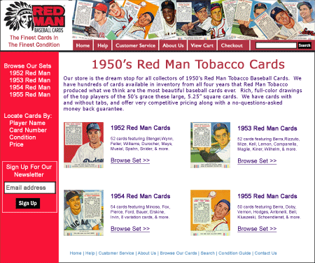
Last month, I started a three-part series on how even a small company can undergo meaningful optimization on their web site while on a limited budget. In Part 1, I talked about the importance of setting up the proper analytics measurements, so that you can determine which changes to your site are effective and which are not. As we’ll see below, those analytics can also quickly point you to opportunities for improving your web site. Also in part 1, we introduced our hypothetical example site, RedManBaseballCards.com, an online store that sells, well, Red Man baseball cards.

Our hypothetical example web site: RedManBaseballCards.com, an ecommerce site
Eliminating Usability Issues on Your Web Site
Now that your foundation is in place with accurate analytics, it’s time to start identifying the most valuable opportunities for improving your web site. Ask a group of people what needs to be improved on your site first, and you’ll probably get a lot of different answers. Some would say that your site looks outdated and “needs an updated look”. Some will say that you need to optimize your landing pages. Others will say that you need to start running A/B tests. Some of these are good ideas, some are important things to do. But for me, the first thing to do is to eliminate any usability issues on your web site.
By “usability issues”, I’m talking about elements of your web site that can make it difficult for some visitors to complete the tasks you desire. These visitors want to be your customers. They’re ready to buy, contact you, register, or whatever you’re hoping for them to do, but something in your site’s layout, flow, functionality, etc., is stopping them. Maybe they can’t find the product they’re looking for. Perhaps the pages load too slowly. It could be that they are turned off at some of the information you are requiring that they provide. It could be any number of issues.
Why Usability First?
Many people will say that it doesn’t matter if your site is easy or difficult to use if it isn’t motivating people to try to convert in the first place. They’ll say that the first step is to optimize key pages on your site to entice visitors to convert (to add to cart, to fill out your lead form, to make a donation, etc.). I disagree for two reasons.
First, regardless of how boring or “last year” your site looks, regardless of how poor a job it does of convincing someone to order, there will always be some people who seek out your site to do business with you. But if your site makes things too difficult, they still won’t convert. They may use a more expensive method of placing an order with you, or they just may give up entirely.
Second, very often the lowest-hanging fruit is a problem that affects a lot of would-be customers and can be relatively simple and inexpensive to fix. This can often turn into a quick win for large gains.
“We Made Sure Our Site Is Easy to Use. Besides, We tested It.”
Almost 100% of the time, the people closest to the web site—the developers, the designers, the marketers—are just that: too close to the site to recognize usability problems. They’ve been through the mock processes so many times they can do them without thinking. But somebody looking at the site for the first time and trying to register will often have issues you did not anticipate.
And if you think you tested it before launch, review how you tested it. Who did you have try to use the site? Who observed them? A common pitfall in novice testing is testing with friends & relatives who might “soften” their comments about what is easy or difficult because of their relationship with you. Another common problem is having a member of the web site team actually conduct the testing, which can often result in unintentionally “leading” the test subject through the task and again, having the test subject be less than forthcoming with candid feedback on the site.
Disconnecting yourself from the testing process is the best way to quickly uncover the biggest issues with your site. And that is the quickest path to improvement of your site. So what are the best ways?
Usability Studies
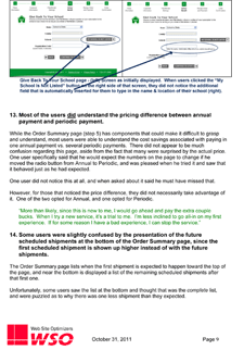
The most complete method to identify issues with your site is to hire a firm to conduct a Usability Study for the site. Here, the firm will work with you to identify key representative tasks for test subjects to perform. The firm will recruit test subjects to attempt to perform these tasks in one-on-one sessions. The testing firm is experienced to get the test subjects to continually verbalize what they are thinking as they attempt the tasks, while not providing any information that can accidentally help the test subject with a task.
The firm will work with you to ensure that the test subjects are representative of the people you would expect to be using your web site, and will conduct these tests at a neutral location so that the test subjects will be honest and candid about what they are experiencing. You will likely be able to observe these tests, or watch video of them. You will be amazed by what you learn! And typically the firm will summarize their findings in a report and/or presentation that includes recommendations for the most important “fixes” for your web site.
While they are almost invariably worth the cost, full usability studies can be quite expensive, running from $5,000 to $15,000 for even a small web site. What are some alternatives?
Less Expensive Usability Testing Methods
Before reading on, I’d advise that you go back a few paragraphs and re-read the part about the pitfalls of conducting your own testing. I can’t stress enough how important it is to disconnect yourself as far as possible from the testing in order to minimize any biases that might otherwise result.
That said, there are some services, such as UserTesting.com, that can allow you to run some basic tests yourself while avoiding most of those biases. These services have a large stable of testers who are trained to think out loud as they attempt tasks you create. You can’t guarantee you’ll get users that fit into a tightly defined demographic, but you can specify basics such as gender, age, location, etc., for those taking your tests. Your tests will be shorter, typically around 15 minutes, but also much less expensive, around $50 per test or so. And it’s very fast. Generally you’ll be able to review video of each test within about 24 hours of posting it.
Using these kinds of “crowdsourced” user tests, you can do some basic testing quickly and inexpensively. You can also run a couple of these tests to show your boss to help get funding for a more complete usability test from an outside firm.
Our Example Site
Let’s continue our hypothetical example of our RedManBaseballCards.com electronic store. Ideally, we would have commissioned a full usability study. After all, our target audience is not only baseball card collectors, but people who collect from a very specific set of cards. A common shopper might not know enough about these cards to make informed decisions, and that might show itself in testing. A commissioned study can ensure that all the test subjects are online shoppers who are familiar with this product, or at least people who commonly buy baseball cards online.
However, if that were too expensive, we could have at least done six to eight individual tests through UserTesting.com for sample tasks such as:
- Finding specific cards and adding them to your cart
- Signing up for the newsletter
- Purchasing a gift for a friend who collects these cards
- Use a discount code that was obtained from a previous purchase to place an order
While we might receive feedback on things such as the color scheme or logo, these are just opinions and not really part of the scope of a usability test. However, things we are concerned about might be:
- One or more users expressing concerns about the physical condition of the cards for sale (an important issue in card collecting)
- Two or more users expecting to be able to locate cards based on the team the player plays for, but being unable to
- Someone not completing an order because they are uncertain as to whether it can be returned
- Someone getting frustrated because it is taking too long to load one or more pages on the site
Each of these things will probably stop you from completing a sale, and each is probably pretty simple to fix. So we would observe all of the tests, and make a list of everything that is a cause for concern, determine how we would fix each area for concern, and prioritize them, based on the level of effort required and the severity of the problem.
Other User Feedback Tools
In my opinion, nothing beats watching strangers candidly attempt to complete desired tasks on your site. But there are other tools available that can shed light on what things are giving your users issues on your site. Most of the time, we combine usability tests with many of these tools to get a complete picture of the usability issues for a given web site.
- Session recording tools such as ClickTale or SessionCam
- Exit surveys such as Qualaroo and http://www.iperceptions.com/ from iPerceptions
- SurveyMonkey to email surveys to past users, both customers and those who did not convert
- Reviews of Contact Us form submissions and customer support chat transcripts (if they exist) to see what kinds of things would-be customers took the initiative to discuss with you.
Review Your Own Analtyics
We already talked about making sure your analytics are set up and set up correctly. The focus on that blog post was KPIs, but there are other metrics that can give you important information about what is working, and what is not working on your web site.
Site Search – Review the local searches being done by users on your site. Are there some things that are consistently searched most often? What are users having troubles finding? What is not obvious to them? Try searching for the more frequently searched queries yourself. Are the results that you see the most relevant? Do you think they would answer your customers’ questions? In our example, we might see that people search for things like “condition guide”, “mint condition”, or “returns” frequently, and that can tell us areas that are important, but not clearly described, on our site.
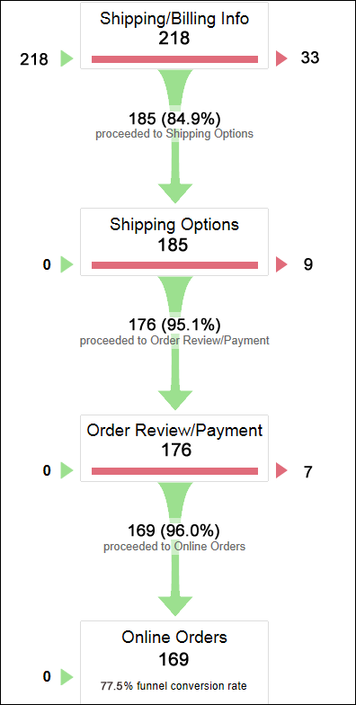
Conversion Funnel Abandonment – What percentage of users who start to checkout (or start to convert by filling out a form, etc.) stop before completing the process? Is there a particular place in the process where people tend to drop out? If so, think about what on this page is causing users to stop? Have you not built enough trust? Are you asking for too much personal information? Perhaps there is a technical error on that page which concerns people.

Example Funnel Report from Google Analytics for our hypothetical Red Man Baseball Cards web site. (click for larger version)
Bounce Rate – We did a whole blog post on this metric a few months ago. Key pages with high bounce rates can give valuable clues to what is not working on your site. If you have landing pages from online ads with high bounce rates, or product detail pages with high bounce rates, you probably need to do some Landing Page Optimization, so look to the final entry in this series for more on that.
Summary
Before you tackle individual landing pages or start tweaking specific calls to action, the best use of your time and funds is identifying and addressing issues that affect your entire site. Issues uncovered during Usability Testing can be the ones that are easiest to detect, fastest to correct, and have the greatest impact on your bottom line. Get those in order and then start fine-tuning the rest of the site.
Next step: Testing & optimizing specific elements of key pages


Pingback: From Rags To Riches – The Pauper's Guide to Optimizing Your Site's Performance | Tom Bowen's Blog - Web Site OptimizersTom Bowen's Blog – Web Site Optimizers()
Pingback: Fine Tune Your Most Important Pages to Increase Your Web Site's Conversions | Tom Bowen's Blog - Web Site OptimizersTom Bowen's Blog – Web Site Optimizers()
Pingback: Articles PLR Download()