When it comes to building an email list for things like your monthly e-newsletter or periodic special offers, we all want to attract as many email addresses as possible that are valid, and will open our messages. Making the sign-up process easy on your users will take you a long way toward that goal. An unpleasant sign-up experience will cause more of your customers to ignore your emails, or abort the registration process entirely.
So what are the best things to keep in mind for your email sign-up process? What companies do these things well? Which ones make mistakes? Here are ten guidelines to consider when designing (or reviewing) your site’s email registration process, along with examples of major companies that do them well and poorly. In gathering these examples, I looked at the email registration process of 22 major retailers to experience their process.
As always, remember that these are just guidelines. Every site and every site’s customer set is different. Be sure to test different methods for the best results for you.
Present the opportunity to sign up on every page on your site, and in the same spot.
You definitely want to make this easy on your customers. Your site visitors likely will make multiple visits to your site before choosing to request your emails and if you are consistent with the placement of the option on your site, they’ll be able to locate it and begin the process easily when they are ready. If the option is only available on certain pages, however, it can be frustrating to your users who are looking for it, knowing that they have seen it before, but cannot find it when they want it.
To this end, I like to make sure that the link of form is called out to make it easy to find. You can do this with just a little icon of an envelope, a different treatment of the link that stands out better, or by including an actual form right there on each page (see below). Bonus points for getting all of this at the top of the page so it is visible with each page view. That’s not always feasible, but you’ll probably get more sign-ups if it is.

The Ikea site has only a small link in the upper-right that looks the same as all other links in the header.

Grocer Central Market has much more noticeable link to “Subscribe to eFoodie” in the “Stay Connected” section of their header.

The email sign-up link for Office Depot is hidden behind the “Deals” icon in their header. This isn’t what most people will be looking for when they are trying to sign up.
Most major companies do this reasonably well. In many cases, the link to sign up does not stand out any better than less important links, but most companies have a link or form on all pages and in the same place. But not all. Etsy.com has a form at the bottom of the home page, but no other option on any other page. I could also only find a link on the Home page of Target.com and TraderJoes.com, but not on any other pages of those sites.
Try to show an actual sign-up form on each page instead of just a link.
As I say above, you want each page to offer the ability to register. Many sites do this with a link, but some put the actual form on each page. This is great because it not only makes the registration process stand out, but it allows your customer to sign up right there without having to go load up a new page.
Putting the form on each page can offer several challenges. A form takes up a lot more space than a simple link, and screen real estate can be valuable—especially in the page header. Designers may push back on this requirement. If you have a Site Search box in the page header, having two different forms can be confusing. The Site Search is probably more important if you are selling things on your site, so in this case you might be better off putting the Email form in your site’s footer.
Additionally, you or your company might want to require more than just an email to sign-up. There can be valid reasons for this, but more form fields obviously take up more space. Below we discuss alternatives to requiring more information other than just the email.

The Gap has a simple, but easy to spot form in the footer of the site to allow users to register quickly and easily from any page.
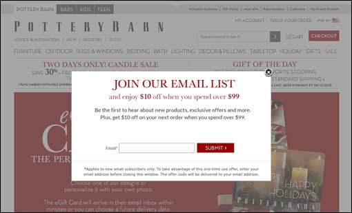
A one-time pop-up requesting visitors to sign up is okay.
For over a decade, pop-ups have been the scourge of the internet! However, the days of pop-up ads are pretty much gone. The new generation of pop-ups, the lightbox or modal, are typically used appropriately—to give users a chance to perform a quick task without leaving the current page. One effective use of lightboxes is to offer a visitor the chance to sign up for your newsletter.
Our first inclination is that this interruption will annoy customers and run them away. However, when done properly, this is typically not the case. Offer the lightbox pop-up only once in a session—either right when the user enters the site or after a second page view or they’ve been on the site for a specific amount of time. Don’t show the lightbox if you know the visitor has already signed up for your list. And consider not showing it on future sessions, or perhaps not again for 30 days or so.
Of the sites we surveyed, approximately 20% used some sort of a one-time lightbox or pop-up to suggest signing up for the email list. I suspect this will grow in the coming months.
Most tests have shown that properly implemented lightbox requests for emails have had negligent impact on a site bounce rates. So test this method and see if it increases your subscription rate without increasing your bounce rate.
Your registration form should request the user’s email and as little else as possible.
We all want to know as much as possible about our customers. And we have grand ideas about segmenting out our list several different ways with tailored messages to each. It’s great to gather this information where possible, but don’t do it to the detriment of user’s completing the sign-up process.
Whether your form is in the footer of every page, or on a page all its own, there will be a direct correlation between the number of fields on the form and the percentage of users who complete it. The only piece of information that you definitely need is your customer’s email address. Think hard about asking for any other information. Even if you have optional fields on that form, it will look like more work to many and they won’t complete it.
In some cases you may have some requirements that force you to ask for at least one more piece of information, such as a ZIP code or confirmation that the user is over a certain age. Include what you must, but be vigilant about asking yourself if anything other than email is absolutely necessary. Even asking for email a second time to guard against typos will affect your completion rate.
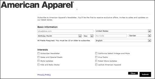
Sadly, there are many examples of asking for too much info from many large retailers. I found examples of forms with five, six, and seven fields being requested, all required. I found forms asking for physical address (even though it’s an email being signed up for), as well as birthday. The intent on such information is generally good, but to the user, it is very intrusive and causes many to just quit.
Include a link to your Privacy Policy as close to the form as possible.
You no doubt have a link to your privacy policy in the footer of your site. And if the registration form happens to be in the footer of your site as well, this might be sufficient. But if you link to a dedicated registration page, even though that page also has the Privacy Policy in the footer, you should include a link to the Privacy Policy right there next to the form.
And if your form is at the top of each page, or on a side-bar, or appears in a lightbox or some other kind of drop-down, a simple link to the Privacy Policy in that form will add very little space requirement. Put it in there. Even if few people click it, having it right there just sings transparency to your user base. They’ll trust you more and will give up their information more willingly.

On the Toys R Us website, a link to the Privacy Policy appears as part of the email sign-up form, building trust.
In the sites I looked at for this article, a little less than half of the actual registration forms had privacy policy links nearby. This is disappointing because in no case that I recall was there an issue with space to show such a link. Will not showing the link kill your registration rate? Probably not, but it probably will affect it negatively to some degree. Why not include it?
Include an example of what your customers are signing up for.
When you encourage users to “sign up for special offers” or “sign up for our newsletter”, do they actually know what they’re registering for? How do they know they will be of value? If they can easily see an example, that might convince them to sign up.
Very few sites do this, and it is costing those that don’t some engaged readers. If you have a registration form on each page, it can be difficult to show an example right there. But if you have a dedicated sign-up page, there will likely be room to show a thumbnail of one of your past newsletters or emails. No matter where your form is, you can certainly include a small link to “View recent newsletter” that can be clicked to show your customers what they are getting.
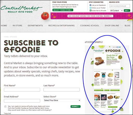
On the Central Market email sign-up page, they show a good example of a recent “eFoodie” to give customers an idea of what they are signing up for.
Present a clear confirmation after your customer signs up.
I am surprised at the number of companies that present a tiny little message, sometimes almost unnoticeable, after the customer has signed up. In most cases, this occurred when the sign-up form was on each page, and the confirmation consisted of just dynamically replacing the form with a very short messaging saying that the registration had been received.
The problem is that in these cases only a small portion of the page changes at all after submitting the form, resulting in a page that looks virtually the same as before. In some cases, users will be unsure as to whether their registration was received or not.

On the Wayfair site, the email sign-up form appears in the lower-left hand corner of the page. Upon filling it out, only that small part of the page changes. This is a small percentage of the overall page, and it can be easy to miss that confirmation message, confusing the user.
Much better is to take the user to a confirmation page that thanks the user, and sets an expectation of what should happen next. If you require them to confirm their registration by acknowledging receipt of a confirmation email, tell them that. Let them know when they should expect to see their first email newsletter. Give them other options to keep up with you, such as following you on Twitter, Facebook, etc.
Even with the full canvass of a dedicated screen for the confirmation page to work with, some companies still messed this up. Target’s confirmation page simply said, “online offers will be coming your way.” At Office Depot, all we got was “Continue Shopping”.
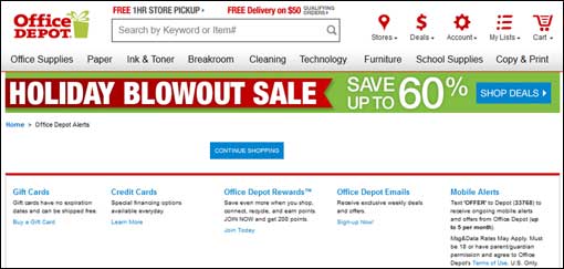
The Office Depot confirmation screen is almost non-existent. Not only does that look unprofessional, it misses an opportunity to direct an interested customer to other microconversions such as following them on Twitter or registering a Rewards card.
Wait until AFTER the initial sign-up to ask more detailed questions.
As I said above, as marketers, we love to know as much about a potential customer as possible. But rather than use a sign-up form that asks 10 questions about the person signing up, just ask for the person’s email. Then on the resulting confirmation screen, you can ask additional (optional) questions about the customer such as name, location, gender, etc.
You are much better off having a larger list of customers you know less about, but are happy customers who will open your emails than a smaller list of customers whose gender and first names you know. If people are taking the initiative to register for your emails, they have interest. And while they’re fairly likely to give you information that will help them receive more relevant messages, they’ll do that more willingly when it’s not a required part of a long form.
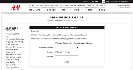
At H & M, after only having to provide my email, and agreeing that I was over 13 years old, I got this confirmation screen offering the chance to tell them more about myself if I wanted.
There were several sites that did this effectively. However, it can be taken to extremes. The Ikea site not only had six required fields along with three more checkboxes, upon submission of the form, I received a page with five more questions to segment me (and many of those had additional questions based on my answers). It might amaze you to know that upon answering those questions, I received a page that had several more questions for me to answer! I don’t know how much longer that would have gone on as I chose not to answer those questions.
Send an email confirming the user’s registration.
They are signing up for emails for goodness sake. Start by sending them an email saying that you received their request. You may think you just told them on the confirmation page on your site. But different people take in information differently. Send out that confirmation email, and include at least the same basic information as you do on the confirmation page of your site.
Unlike the confirmation page of your site, the email is something your customer can choose to hold onto in the Inbox and reference again in the future. If you have special offers or additional memberships you hope an engaged user will join, this email is the perfect place to talk about those.
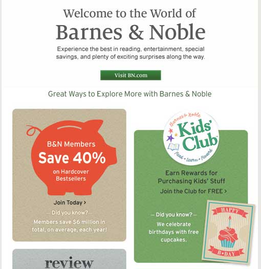
The Barnes & Noble confirmation email clearly communicated the receipt of our registration, but also offered six different next steps I might want to take.
Astonishingly, five of the companies I signed up for in this exercise failed to send me a confirmation email. It could be that those emails were sent, but not delivered, but they did not end up in my spam box, and regardless, if the email is so poorly constructed that it does not get delivered, the end result is as bad as if none were sent at all.
Consider a discount code for a future purchase in the Confirmation Email.
You’ve just had a potential customer express interest in your business. Strike while the iron is hot! Include a special offer such as a discount on their next purchase right there in the confirmation email. Similar to remarketing, giving them an incentive to order is going to have by far its greatest effectiveness right then while they’re thinking about you.
Beyond that, a personalized code in the confirmation email can help you quickly identify which of your email list is more engaged than others. Those that use the discount code shortly after receiving it are probably more responsive to email offers than others. This is an excellent segment to market special offers to and treat a little bit differently than your entire list as a whole.
If you do include a discount code, be sure to include the expiration date in your email (if the offer has one), or any other requirements such as minimum purchase, etc. And if your store has brick & mortar presences as well, offer a printable coupon in the email that can be used there as well.
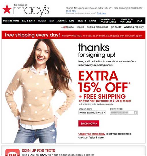
The Macy’s confirmation email included a promo code to save 15% off my next purchase. Requirements of the offer were clear, although there was no expiration date given (if there is one). There was also a button to print the coupon for in-store use.
In all, about a third of the sites I signed up with sent me a confirmation email with a discount code to entice me to shop with them soon.
In Conclusion…
Email marketing is easily one of the most effective methods of increasing your sales—whether online or offline. And you normally think that the larger the list, the greater effect it has. And that’s true to a certain degree. But equally important is ensuring that your methods of growing that list are consistent with the desires of your customers. An easy, non-intrusive registration process will play a large role in the effectiveness of your email campaigns.




Pingback: Marketing Day: December 26, 2013()
Pingback: Marketing Day: December 26, 2013 | Smart Affiliate Secrets - Affiliate Marketing Strategies()
Pingback: Marketing Day: December 26, 2013 | CABizNews.com()
Pingback: [Beginners guide to Deliverability] Lesson 6, Single Opt in, Confirmed Opt in & Double Opt In | blog.inboxplacement.com()
Pingback: Marketing Day: December 26, 2013 « TLC Niche Marketing()
Pingback: [Beginners guide to Deliverability] Lesson 6, Single Opt in, Confirmed Opt in & Double Opt In | Alglete – Blog()