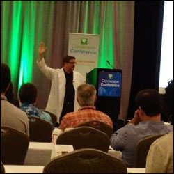
Brian Massey at Conversion Conference
Conversion Conference was in Fort Lauderdale was last week, and it truly exceeded my expectations by a long shot. In fact, my biggest regret what that I could not somehow attend two sessions at once in many instances. The presentations were that good. Some of the most enlightening sessions were from terrific speakers like Tim Ash, Chris Goward, Brian Massey, Jenny Halasz, and Dennis van der Heijden. In many of these cases, the presentations were about specific case studies or higher-level concepts to be tested. Chris Goward summed it up best when he said that there is no such thing as “conversion best practices”. Everything should be tested.
However, there were several “quick hits” that I think can be taken back and applied right away with confidence. Here are ten of them.
- Reduce the number of choices on your page. Both Tim Ash and Susan Weinschenk talked about this. If you throw too many choices on a page, it actually tires out the brain of your visitor. This can result in either their being too “brain fatigued” to finish their checkout before leaving, or even cause them to just give up right then. Instead, remove similar choices on product category and landing pages. Consider using things like “product selection wizards” rather than traditional filtering tools to make the product identification process easier on your visitors.
- Identify landing pages where a person’s face is the dominant element and might be taking focus away from what you actually want your visitor to do. According to Susan, the Fusiform Facial Area of our brain makes us zoom in and focus on other people’s faces. It’s part of our basic makeup. On your landing page, it takes away from focusing on the part of the page you really want your customers to pay attention to. If you are using a prominent human image, having them looking at your call to action can be effective.
- Remove product carousels. I can’t count the number of people who mentioned this. The motion on the page again triggers a basic instinct in our brain and takes the focus away from what you really want the visitor to do. I came to this conference thinking that it was only poorly designed carousels that were a problem. However, I am now of the belief that it is rare that a product carousel is a valuable piece of the page.
- When offering a range of service levels or product options, list them from highest to lowest. Tim Ash spoke about this in his keynote and it was solid advice. If people see the lowest price first, all other prices start to seem high, even if they give better value. But if they see a high price first, then most all of the following lower-priced levels seem more feasible. Tim even suggested starting with a very high-priced “anchor” product or service level, knowing that it will not be chosen much at all. It can set the foundation for more visitors choosing the next highest level.
- Test free shipping thresholds at $99 instead of $100. This came from Charles Nicholls‘ presentation on E-commerce Insights.

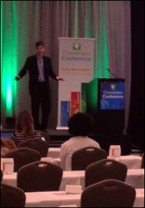
Charles Nicholls at Conversion Conference
You may have free shipping on all orders, or it may kick in at a different threshold, but for many sites, $100 is that magic line past which they offer free shipping. According to Charles, research shows that $99 is a much more palatable price to shoppers than $100, and making this change has shown excellent results.
- Have a page on your site that lists all of your publicly available promo codes. It’s no secret that many people start a checkout process and see that little box for a promo code and then go straight to Google to look for a code to use. Nearly half abandon their checkout at this point. Charles talked about a case where Macys had a link right next to that box that took users to another page on the Macys site that listed a number of valid codes. Over 40% of the visitors to that page converted in the same session.
- Implement retargeting. If you are not familiar with it, retargeting involves getting promotional messages in front of visitors who have left the site without converting, either via targeted ads on other web sites, or by sending a direct email. On average, 26% of identified cart abandoners who are retargeted will convert. Charles did an entire session on retargeting, so it’s far too much to go into in this blog post, but I’ll look into doing a post dedicated to Retargeting soon.
- Redesign forms to capture emails as early as possible in the session. Obviously this goes to Retargeting above, but it also makes so much sense. Everything from moving the email field up to the top of the form, to capturing the email when it is entered whether the form is submitted or not, to using a light box to ask for the email early in the session had benefits. I would have thought for sure the light box would just lead to a sharp increase in bounces, but doing so actually has almost no effect on the site’s bounce rate.
- Keep the far right side of your pages free of things like buttons and other elements that can be clicked. John Whalen pointed out that with the proliferation of tablets and “hybrid” machines (tablets with built-in keyboards), more people are using their fingers to scroll up and down, and almost invariably they use the right-hand side of the page to do that. On sites that had the right side cluttered with buttons and such, many users would try to scroll and instead end up clicking a button by mistake.
- Review the error messages on your site to speak in human language terms (as opposed to engineer language terms). As Susan Weinschenk pointed out, people expect technology to follow human to human rules. Error messages such as “Unexpected Error” just frustrate your users. Ask your development team for a full list of error messages and review them. Change messages such as the one above so that they make sure the users knows that they did not do something wrong, and to give them an option to contact someone to accomplish their task.
Again, it’s important to point out all sites and all pages are different. There are certainly cases where one or more of the above items will make no difference, or possibly even hurt your site. But I’m betting those are a very tiny minority. But I’m also betting that if you try them out and look at your metrics, you’ll be pleased with what you see.
On a final note, I highly recommend you attend one of the future stops of Conversion Conference. These two days were of priceless benefit to marketing professionals responsible for their company web sites, as well as agencies, and in-house web developers. Check out the schedule of future Conversion Conference dates & locations here.


Pingback: Conversion Conference Blog » Highlights and Takeaways from Conversion Conference Fort Lauderdale()